When homes are first built, their aesthetics and design are modern. However, just as fashions change and bell bottoms and tie-dye shirts become a fad of the past, so do certain home designs. When we meet with clients in Tarrant county, common bathroom complaints we hear are oversized and in most cases, unused tubs taking up space, outdated plumbing and lighting fixtures, inadequate storage and poor floor plans that complicate routines.
These days, owners are gravitating toward a more clean, spa-type look with an efficient layout that compliments their daily routines. We’ve compiled the most common pre-remodel complaints by owners as well as solutions to them. Take a look and gather inspiration for your own!
Hudnall Farm Bathroom Remodel
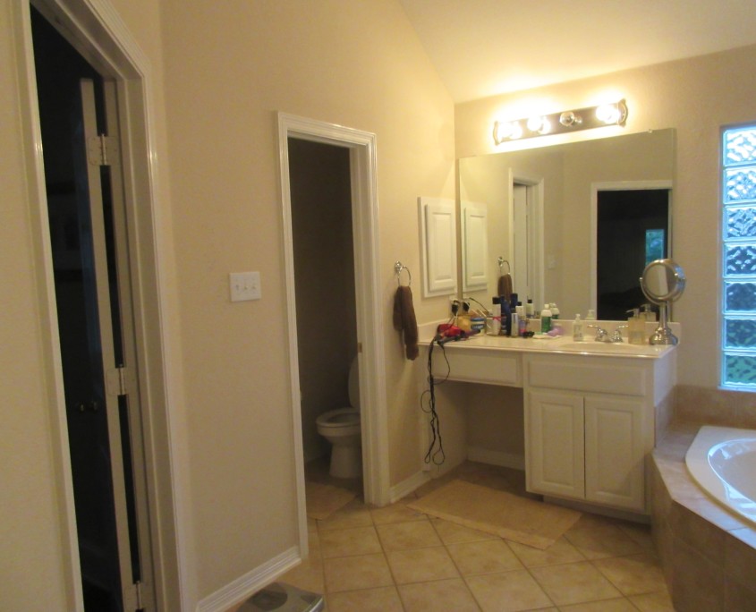
The dilemma: The owners of this Keller home were very dissatisfied with their “builder-grade” bathroom. The over-sized tub, cramped shower, big-box store cabinets, and brass hardware did not compliment the homeowners style. They wanted a modern bathroom they could retreat and relax in after a long day.
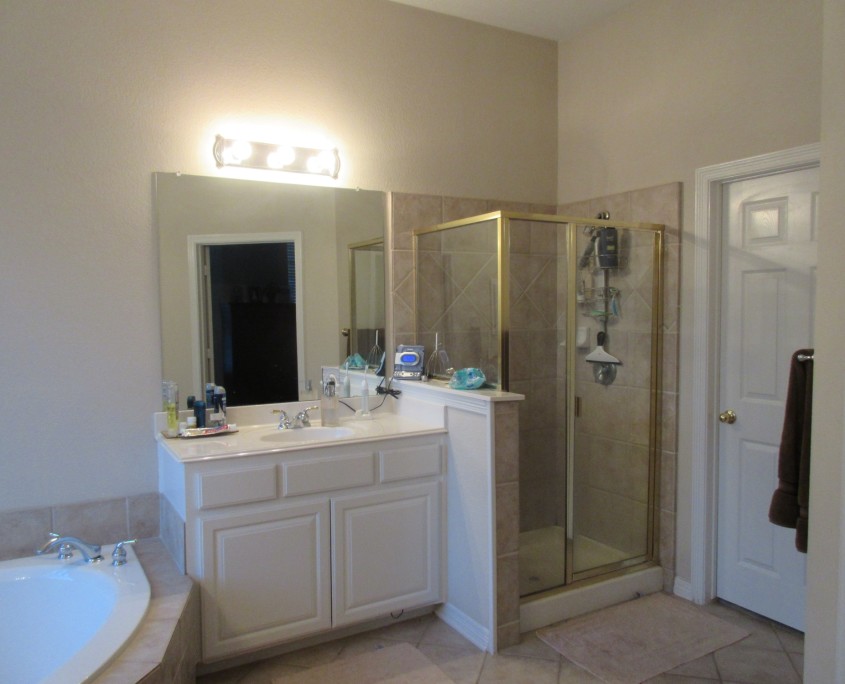
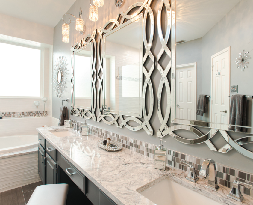
The solution: The new space was designed with comfort, functionality and aesthetics in mind. We began by gutting the bathroom, moving plumbing to accommodate changes to the vanities and shower. The new vanities feature additional counter space, including pull-outs for cosmetics and toiletries. The oversized tub has been replaced with a soaker tub that takes up less space and is ideal for winding down in after a long day.
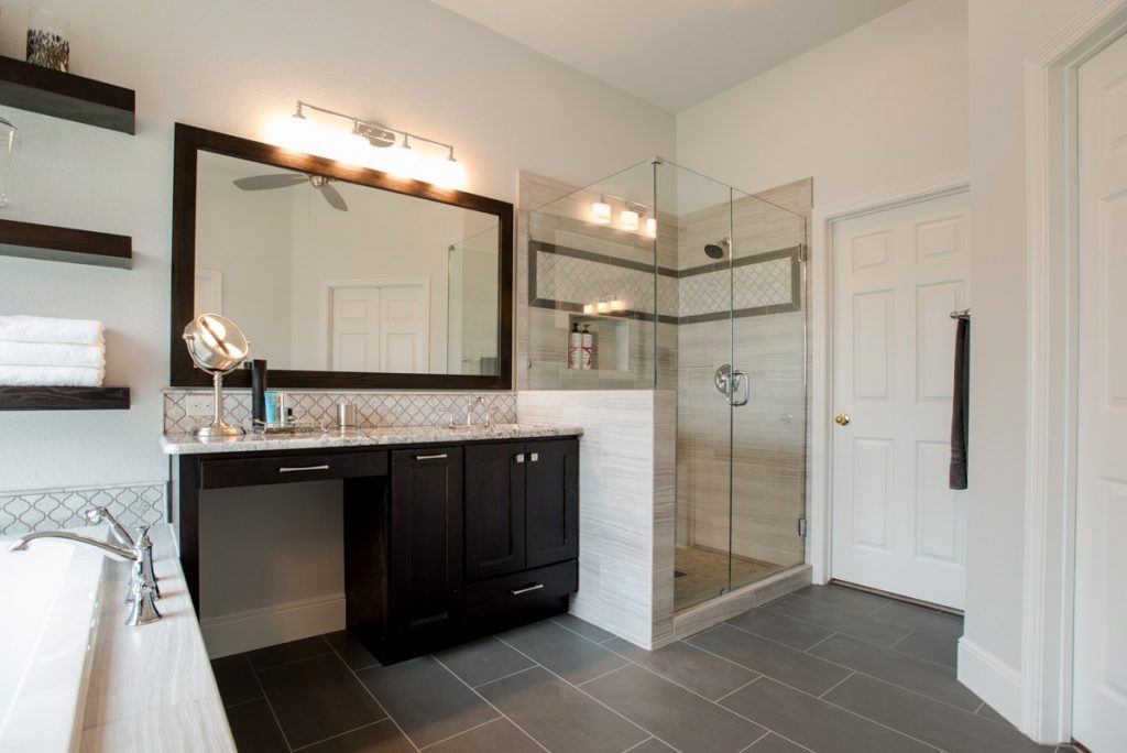
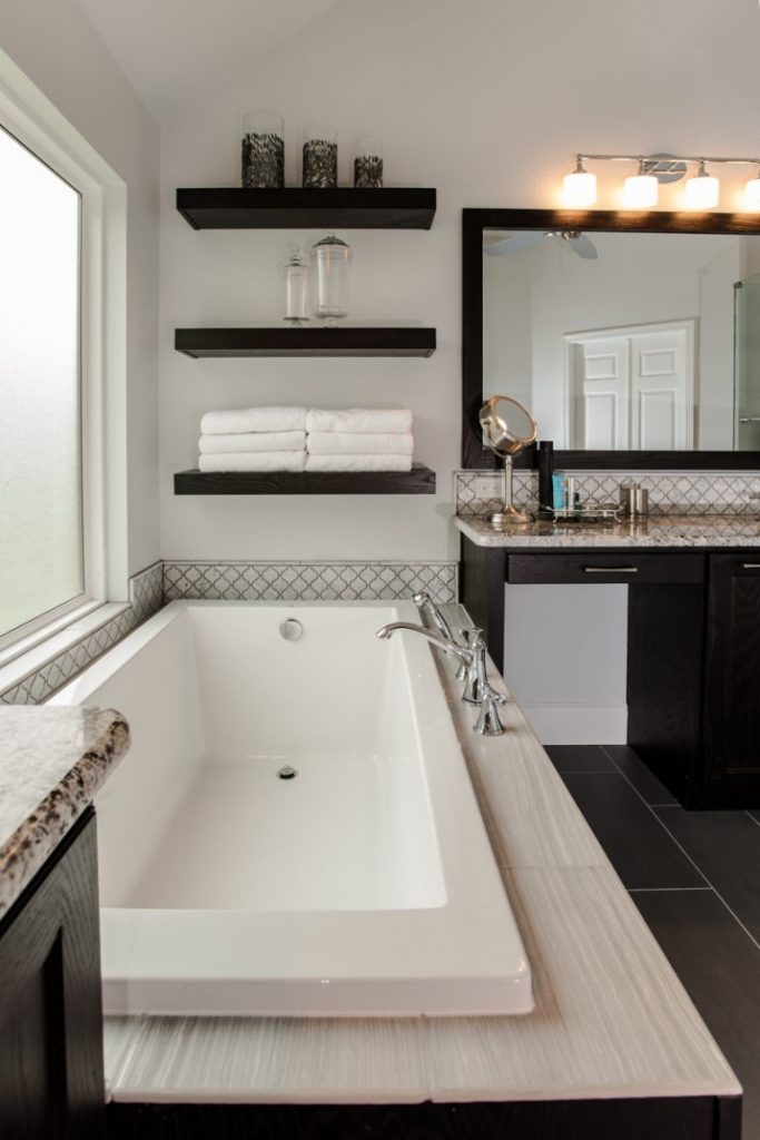
Tile plays a dramatic role in this newly remodeled Keller bathroom. Decorative marble tile is incorporated above the tub, across the vanity and on the shower walls. It’s the mixture of neutral colored tiles contrasted against custom, dark stained cabinets that provide dimension to the new bathroom design. We did away with the brass and added chrome plumbing and lighting fixtures to add a polished and sleek finish.
Cedar Bluff Bathroom Remodel
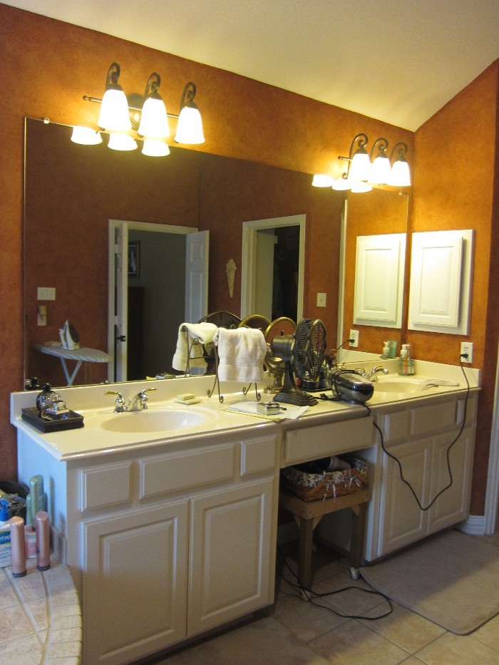
The dilemma: The pre-existing bathroom was mundane with a cramped shower, poor lighting and insufficient storage, resulting in a cluttered appearance. The owners of this Aledo home wanted a transitional bathroom design with sufficient and systematic storage and lighting.
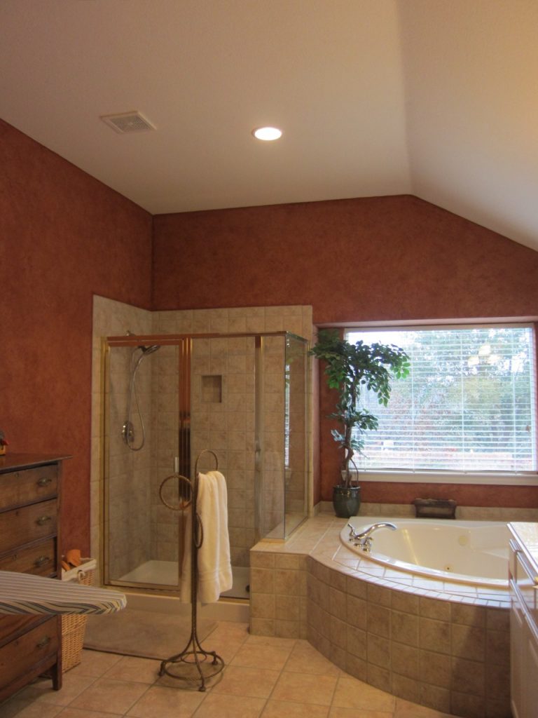
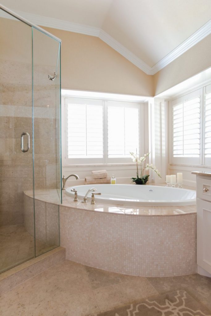
The solution: Utilizing part of the tub deck, we integrated the shower and tub to provide seating. The curve of the tub deck was drawn out meticulously in order to follow the shape of the tub and balance the shower. This keeps the shower size spacious without confining the walk-way into the shower.
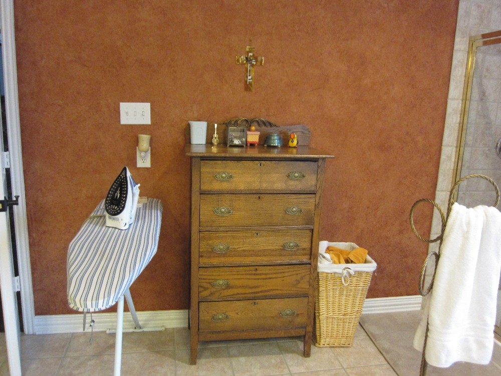
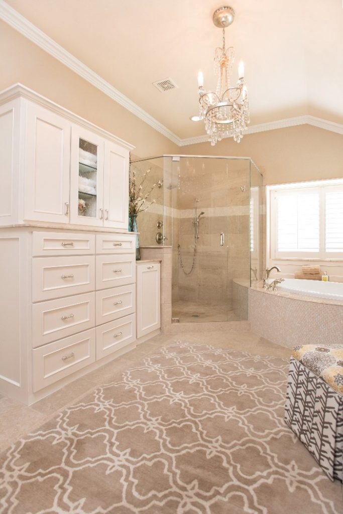
The pre-existing unused open space to the left of the shower now houses an antique cabinet with linen storage and a laundry pull-out, rendering systematic storage and establishing balance in the room.
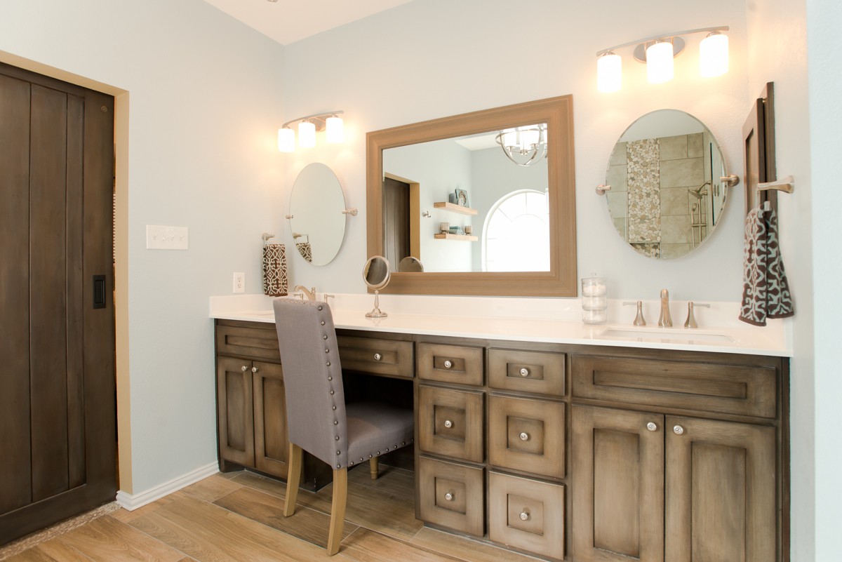
The vanity section was completely gutted and re-designed for functionality. The homeowner wanted a seating space for applying make-up and a tower in the center to house her cosmetic mirror. The tip-outs and small drawers below both under-mounted sinks allow for more storage. The end result is a designated vanity area when doors are opened and a clean finished look when the doors are closed.
We increased the lighting throughout the room with a variety of sources. Rather than utilize one central light, each area of the room was provided lighting. Recessed lighting was installed over the shower for better task lighting while showering. We added LED puck lights over the vanity in the wood valence and wall sconces on either side of the mirrors. To finish, a beautiful chandelier adds ambient lighting as well a focal point of elegance to the room.

